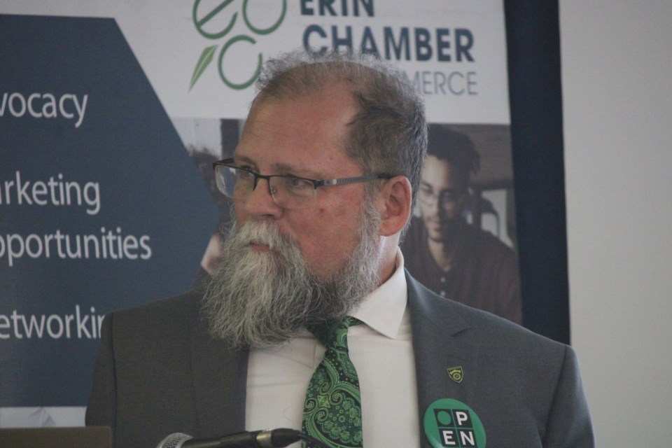
ERIN – The Town of Erin’s rebranding rollout wasn’t perfect, Mayor Michael Dehn admitted, but he stressed it was necessary to move quickly on it for financial reasons.
Those exact financial reasons he was unable to say on the record in a phone interview Monday but Dehn said the town could save at least $100,000 by moving this process along quickly.
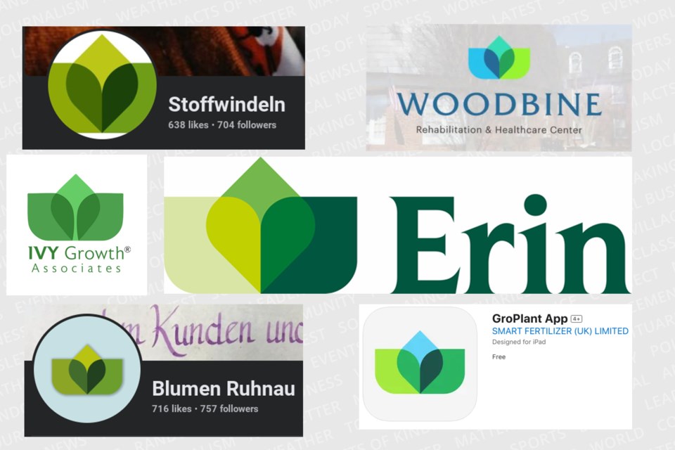
The Town of Erin unveiled a new logo and refreshed municipal brand design on Friday which was met with a social media backlash by residents who did not appreciate the traditional shamrock being replaced and noted its similarity to other logos from around the world.
A petition to restore the original logo has surpassed 600 signatures as of Monday morning.
Dehn is aware of the backlash but noted he hasn’t received as many calls about it as one might think and thought people are mostly “Facebook warrioring” by airing their grievances on social media only.
He said part of the issue is confusion over what the Town of Erin actually is, which at the municipal level consists of more than just the village but also places like Hillsburgh, Ospringe and Brisbane.
“The Village of Erin has always had a shamrock and will continue to have a shamrock but a lot of people think there’s only the Village of Erin and they forget there’s a whole town around it,” Dehn said. “Some of it is people just really like the shamrock.”
On the topic of the logo being similar to others, Dehn said it is coincidental. Trajectory Brands, a Toronto-based agency who worked with the town on this rebranding for $20,000, also said it was coincidental when asked on Friday.
“We went through multiple designs, this was not the only design that came to us and the colour palette that was picked was picked by council,” Dehn said. “Are people upset because it’s a very simple design? It appears to be, but I guess we could have done more due diligence after the fact, after what we selected but we were very comfortable with the design that was selected.”
Dehn acknowledged the town needs to learn to communicate better with residents but also pointed out they could have done so if they had more time.
A lack of time was also why the rebranding process moved along as quickly as it did. The town had put out a media release on Sept. 4 inviting residents to share their thoughts on rebranding, just nine days prior to the rebranding announcement.
“There’s an economic decision, which is why things went very fast. By doing things very fast we’re saving at $100,000 if not more,” he said. “We could have dragged our feet, waited and added $100,000 plus to the whole process and this is where council kind of had to make a decision. Do we make a financial decision here that we think is beneficial for taxpayers or do we increase the cost and put it on the levy?”
Dehn declined to reveal what this financial decision was at this time but added more information was coming later in the week.
“We did this for the economic and environmental and branding benefit of the community. We did not do this to try to be pains in the ass to the community but sometimes we have to make decisions quickly,” Dehn said. “This one, it’ll become clear why we had to make this one quickly.”


